TL;DR
Listen free for 30 days with Audible
Thousands of audiobooks and originals — cancel anytime.
Start your free trialAs an affiliate, we earn on qualifying purchases.
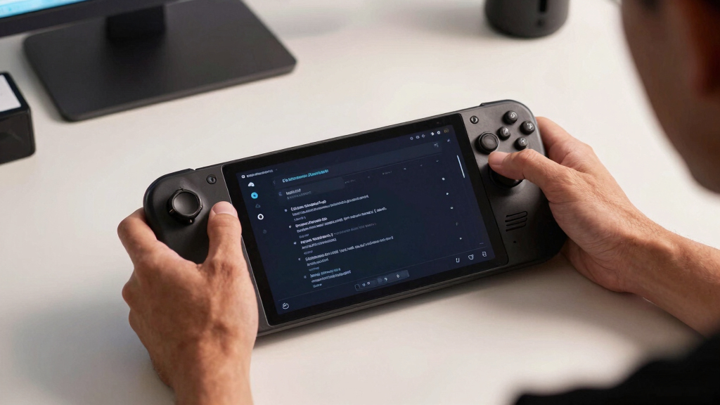
To make tiny text easier to read on Steam Deck OLED, raise UI scale where the game allows it, use SteamOS display and accessibility settings, increase contrast, and lean on the magnifier for dense menus. The Steam Deck OLED has a 7-inch, 1280×800 screen, so text designed for a desk monitor can feel cramped even when the panel itself looks sharp [1].
The first time a strategy game asks you to read a gray tooltip the size of a breadcrumb, the Steam Deck OLED stops feeling like magic and starts feeling like an eye test.
You do not need to give up on the game. You need to make the screen, the game, and the lighting work together, because tiny text usually comes from several small problems stacked on top of each other.
This guide shows you how to make menus, subtitles, inventory labels, quest logs, and dense PC interfaces easier to read on the Steam Deck OLED, using practical settings before risky tweaks.
How to Make Tiny Text Easier to Read on Steam Deck OLED
Raise in-game UI scale first, then tune SteamOS display and accessibility options, contrast, subtitle backgrounds, brightness, and the magnifier. The OLED screen is sharp, but a 7.4-inch 1280×800 panel still makes monitor-first PC interfaces feel cramped in your hands.
Large for a handheld, small for dense PC menus built around desk monitors.
Sharp enough for games, but physical text size still depends on UI scaling.
Best order: game UI scale, subtitle size, contrast, SteamOS settings, magnifier, then desktop-mode tweaks.
Fast Fixes That Help Most Games
Tiny text usually comes from several small problems stacked together: fixed UI size, thin fonts, busy backgrounds, and low contrast. Work from the safest, widest changes toward more specific tweaks.
Raise UI Scale
Look for interface scale, HUD scale, menu scale, or font size. Increase one notch at a time and test the smallest screen you actually use.
Enlarge Subtitles
Use larger subtitle size, speaker labels, and dark subtitle backgrounds so dialogue survives bright or busy game scenes.
Adjust SteamOS
Use display and accessibility settings when Steam menus, launchers, or several games feel too tight rather than one title alone.
Use Magnifier
Magnification is ideal for occasional reads: maps, tooltips, item stats, quest logs, and small crafting recipes.
Boost Contrast
Prefer solid menu panels, dark text surfaces, high-contrast themes, and brightness that fits the room instead of fighting your eyes.
Scale Apps
Desktop-mode scaling helps launchers, browsers, mod tools, and Linux apps that ignore Gaming Mode readability settings.
The Readability Order of Operations
Use this flow when a game looks good in motion but becomes painful inside inventory screens, strategy overlays, journal pages, or tooltip-heavy menus.
Find the Worst Screen
Open the inventory, map legend, quest log, or crafting list before changing settings.
Scale In Game
Raise UI, HUD, subtitle, chat, and tooltip sizes from the game menu.
Add Contrast
Enable subtitle boxes, solid panels, dark themes, or high-contrast UI options.
Use SteamOS
Tune display and accessibility options if the Steam interface also feels small.
Reserve Tweaks
Try desktop scaling, community mods, or font tools only after safer fixes fail.
Why Sharp OLED Text Can Still Feel Tiny
Readability is not just resolution. It is the combination of letter size, contrast, spacing, background clarity, viewing distance, and whether the interface was designed for a handheld screen.
What Actually Helps
The Steam Deck OLED’s deep blacks can make bright text crisp, but thin gray labels over translucent panels remain hard to read. Bigger letters help, yet cleaner contrast often delivers the bigger comfort gain.
Readability Impact Map
Pick the Right Setting for the Problem
Game-level settings are precise. SteamOS settings are broad. Desktop-mode scaling is for apps, launchers, browsers, and tools that live outside the normal handheld game flow.
| Problem you see | Best first fix | Why it helps | Performance impact | Use often? |
|---|---|---|---|---|
| One game has tiny inventory or map text | Raise that game’s UI scale | Targets the exact interface without changing everything else. | ✓ Usually none | ✓ |
| Subtitles vanish over bright scenes | Increase subtitle size and add a background | Creates a clean surface behind dialogue text. | ✓ Usually none | ✓ |
| Steam menus feel small across the device | Use SteamOS display or accessibility settings | Improves the shell, library, settings, and shared UI surfaces. | ✓ Low | ~ |
| Dense tooltips or maps need a quick close-up | Use the magnifier | Zooms briefly without rearranging the whole game layout. | ✓ Low | ~ |
| Launchers, browsers, and mod tools are cramped | Adjust desktop-mode scaling or fonts | Handles Linux desktop apps that ignore Gaming Mode settings. | ~ Varies by app | ~ |
| Advice requires editing system files | Avoid unless trusted and backed up | Risk rises quickly when fixes modify core files or scripts. | ✗ Possible stability risk | ✗ |
Contrast Before Complicated Tweaks
If text is already almost large enough, contrast fixes can be the difference between squinting and reading comfortably. On OLED, the best results come from clean separation, not just brightness.
Low-Risk Comfort Moves
- Turn on subtitle backgrounds or speaker boxes where available.
- Choose solid menu panels instead of translucent overlays.
- Raise brightness slightly when gray text looks muddy.
- Lower brightness at night if white text blooms or feels harsh.
- Use high-contrast UI themes in games that offer them.
Advanced Tweaks
- Desktop font managers can help apps but may not affect games.
- Community mods may improve one title and break after updates.
- System-file edits can cause stability issues if copied blindly.
- Extreme scaling can push buttons off-screen or overlap panels.
- Custom overlays help inspection but can slow repeated menu use.
Traceability Chain
Follow the chain from the thing you notice to the setting that fixes it. The goal is not maximum zoom. The goal is readable text with the least layout disruption.
Symptom
Quest logs, resource labels, subtitles, or tooltips feel too small.
Game Fix
Increase UI scale, HUD scale, subtitle size, and chat font size.
Contrast Fix
Add backgrounds, solid panels, dark themes, and cleaner surfaces.
System Fix
Use SteamOS display and accessibility settings for broad issues.
Comfort Test
Return to the smallest real menu and confirm it is readable.
Quick Decision Guide
When the Deck turns a beautiful PC interface into an eye test, use practical fixes before risky ones. Most readability gains come from scale, contrast, and picking the right layer of settings.
Game Menu
Start with UI scale, subtitle size, HUD scale, tooltip size, and chat font size because they affect the exact text that hurts.
SteamOS
Use system settings when the Steam interface, multiple games, or handheld viewing distance make everything feel tight.
Magnifier
Use magnification for dense moments, not for menus you open every few seconds during normal play.
Key Takeaways
- Raise in-game UI scale, subtitle size, and HUD scale before changing system-wide settings.
- The Steam Deck OLED’s 7-inch-class 1280×800 screen can still make desktop-style PC interfaces feel cramped [1].
- Contrast fixes, especially subtitle backgrounds and solid menu panels, often help as much as larger text.
- Use the magnifier for short reads like tooltips and maps, not for menus you need every few seconds.
- Desktop-mode scaling helps launchers, browsers, and mod tools that ignore Gaming Mode readability.
As an affiliate, we earn on qualifying purchases.
Start With the Fixes That Help Most Games Fast
How to Make Tiny Text Easier to Read on Steam Deck OLED starts with the settings that affect the most games with the least effort: in-game UI scale, subtitle size, SteamOS display options, brightness, and contrast. These changes take minutes, usually cost no performance, and often solve the problem before you touch desktop mode.
- Check the game’s accessibility menu for text size, subtitle scale, or interface scale.
- Raise UI scale in the game’s display or graphics menu if the option exists.
- Turn on larger subtitles and add subtitle backgrounds when available.
- Use the Steam Deck magnifier for dense maps, tooltips, and crafting screens.
- Increase contrast with brightness, theme, or high-contrast settings.
- Test one readable scene, such as an inventory menu, journal page, or settings screen.
For example, a role-playing game may look fine while you roam a forest path, then become painful when you open a quest journal full of pale beige text. Raise the subtitle size first, then the UI scale, then check whether the journal uses a separate text setting.
According to Valve’s Steam Deck OLED technical details, the device uses a 7.4-inch OLED display at 1280×800, which gives you strong color and black levels but still leaves limited physical space for desktop-style text [1]. That means readability is not only about sharpness. It is about how large the letters are on the glass in your hands.
As an affiliate, we earn on qualifying purchases.
Why Sharp OLED Text Can Still Feel Too Small
Tiny text can feel hard to read on Steam Deck OLED because many PC games were designed around larger monitors, not a handheld screen held 12 to 18 inches from your face. The OLED panel can make colors pop, but it cannot magically resize a menu built for a 24-inch desk display.
Think of a city-builder with dozens of icons, budget numbers, and tooltips squeezed into the corners. On your monitor, those labels sit in roomy little boxes. On the Deck, they shrink into pale threads against a busy background.
The Steam Deck OLED display has rich contrast, and that helps when letters are bright against a dark menu. But thin fonts, low-contrast gray text, and fixed-size interfaces can still make your eyes work too hard, especially after an hour of play.
A sharper screen does not always mean easier reading. Readability comes from letter size, contrast, spacing, background clarity, and how far the screen sits from your eyes.
Research in human vision has long shown that contrast and character size shape legibility, especially on small displays [2]. In plain terms: black text on a smoky gray panel may look stylish, but your eyes pay the bill.
display contrast adjustment for portable devices
As an affiliate, we earn on qualifying purchases.
As an affiliate, we earn on qualifying purchases.
Use the Game’s Own Text Settings Before Anything Else
How to Make Tiny Text Easier to Read on Steam Deck OLED usually begins inside the game, because game-level settings target the exact text that bothers you. Look for UI scale, HUD scale, subtitle size, chat size, tooltip size, and menu font size before changing system-wide display behavior.
- UI scale: enlarges menus, buttons, health bars, maps, and inventory panels.
- Subtitle size: helps dialogue-heavy games, especially when text sits over bright scenes.
- Subtitle background: adds a dark box behind speech, useful in colorful games.
- HUD scale: changes gameplay overlays without always changing menus.
- Chat font size: matters in MMOs, survival games, and co-op lobbies.
A good test is simple. Open the smallest screen you actually use, such as a crafting recipe list or map legend, then raise the setting one notch at a time. If the menu starts to overlap or push buttons off-screen, back down one step.
Some games separate subtitle settings from interface settings. A narrative game may let you make spoken dialogue huge while leaving inventory text tiny, so check both accessibility and display menus before you decide the game has no fix.
One tradeoff: bigger UI can hide more of the world. In a shooter, a large HUD may cover corners you need for awareness. In a turn-based game, that same extra-large UI may feel perfect because you spend most of your time reading.
desktop mode accessibility tools for Steam Deck
As an affiliate, we earn on qualifying purchases.
As an affiliate, we earn on qualifying purchases.
Pick the Right SteamOS Setting for the Problem
SteamOS settings help when tiny text appears across the system, the Steam interface, or multiple games. Use system-level changes for broad readability problems, and use game-level settings when only one title has cramped menus.
| Problem You See | Best First Fix | Why It Helps |
|---|---|---|
| Steam menus feel small | Adjust SteamOS display or accessibility settings | It changes the interface you use between games. |
| One game has tiny inventory text | Raise that game’s UI scale | It targets the game without changing everything else. |
| Subtitles vanish over bright scenes | Increase subtitle size and add a background | It gives text a darker, cleaner surface. |
| Dense tooltips are hard to inspect | Use the magnifier | It gives a quick close-up without changing layout. |
| Desktop apps feel cramped | Adjust desktop-mode scaling or font size | It improves browser, launcher, and Linux app readability. |
Imagine you use Steam’s store page, library tabs, and settings menu comfortably, but a management sim turns every resource label into dust. That is a game problem. Start inside that game.
Now flip the scene. If the Steam interface itself feels tight, especially late at night when the room is dim and your hands drift lower, system settings make more sense. You want the whole shell to feel calmer, not just one title.
Valve has continued to update SteamOS with interface and accessibility improvements over time, so keep your Deck current before judging a setting missing or broken [1]. Updates can change where options live and how well scaling behaves.
Make Contrast Do More of the Work
Better contrast makes tiny text easier to read because your eyes can separate letters from the background faster. On the Steam Deck OLED, this means using brightness, dark backgrounds, subtitle boxes, and high-contrast modes where available instead of only making everything larger.
OLED screens can produce deep blacks, which gives white text a crisp, bright edge. That helps in a dark menu with clean typography. It helps less when a game lays thin yellow text over a torchlit cave or snow-white subtitle text over a sunny beach.
- Raise brightness slightly when text looks muddy in a dim room.
- Lower brightness if white letters bloom or feel harsh at night.
- Use subtitle backgrounds when dialogue appears over busy scenes.
- Choose high-contrast UI themes when the game offers them.
- Avoid translucent menus if a solid panel option exists.
Here is a real example. In a sci-fi RPG, a transparent blue inventory panel may look slick, but starfield animation behind it turns item descriptions into glitter. A solid dark background can make the same font feel twice as readable.
According to accessibility guidance from the W3C, text contrast matters because readers need enough difference between foreground and background to distinguish characters reliably [2]. You feel that difference immediately when a subtitle gains a black backing strip.
Use the Magnifier for Maps, Tooltips, and One-Off Menus
The magnifier is best for small text you read briefly, such as map labels, item stats, legal text in launchers, or tiny tooltips. It works like pulling a jeweler’s loupe over the screen: quick, direct, and handy when you do not want to rebuild the whole interface.
On Steam Deck, the magnifier shortcut can help when a game gives you no font options. You can zoom into a quest marker, read the label, then go right back to playing. It is especially useful in games with fixed UI, old PC ports, or launchers that were never built for handhelds.
Use it during the boring-but-needed screens: keybinding menus, server lists, mod launchers, and tiny patch notes. You read the line, make the choice, and move on without turning every menu into a giant wall.
Use magnification for short reads, not constant reading. If you need it every 30 seconds, the game probably needs UI scaling, a different layout, or a monitor session.
The tradeoff is motion. Zooming in and out can interrupt the flow of a fast game, like pausing mid-fight to read a debuff description. For slow games, it feels natural; for twitchy games, it can feel clumsy.
Fix Desktop Mode When Launchers and Mods Look Tiny
How to Make Tiny Text Easier to Read on Steam Deck OLED also includes desktop mode, because launchers, browsers, mod tools, and Linux apps can use different scaling than Gaming Mode. If the tiny text appears in a launcher or desktop app, adjust desktop display scaling and font size before editing system files.
Desktop mode is where small text can get especially prickly. A mod manager may show checkboxes, file paths, and version numbers in a narrow pane. A browser page may look fine until a login form uses tiny gray labels.
- Increase desktop display scaling if every desktop app feels small.
- Raise the system font size if menus and labels bother you more than icons.
- Use browser zoom for web pages, launch instructions, and guides.
- Prefer app settings when only one launcher has the problem.
Be careful with advanced Linux font tweaks and third-party tools. They can help, but they can also make apps wrap text badly, hide buttons, or behave oddly after updates. Save those moves for cases where normal settings fail.
A practical rule: if you only need a launcher for 30 seconds, use zoom or magnification. If you spend real time in desktop mode, tune scaling so the whole space feels comfortable.
Choose Games That Respect Handheld Reading
Some games are simply kinder to Steam Deck OLED eyes than others because they offer UI scale, large subtitles, controller-friendly menus, and readable contrast. Before buying or installing a text-heavy game, check screenshots, community notes, and the game’s accessibility menu when available.
A visual novel with large subtitle controls may feel wonderful on the couch. A grand strategy game with fixed spreadsheet-style panels may ask you to squint at province names, taxes, and tooltips until the fun leaks out of the room.
Steam Deck Verified status can help with general compatibility, but it does not always tell the full story for your eyes. A game can run smoothly and still make you read tiny tooltips. Smooth frames do not comfort tired vision.
- Look for UI scale settings in player discussions and patch notes.
- Check handheld screenshots, not only desktop screenshots.
- Favor games with subtitle controls if you play story-heavy titles.
- Watch for fixed UI complaints in community forums.
For example, a tactical RPG with chunky menus and bold white text may feel better than a gorgeous management game that treats every number like fine print. The better-looking game is not always the better handheld game.
Build a 5-Minute Readability Check for Every New Game
A quick readability check tells you whether a new game will feel comfortable on Steam Deck OLED before you sink hours into it. Test the smallest, busiest, most text-heavy screens first, because those screens reveal problems faster than the opening cutscene.
- Open the settings menu and find accessibility, display, subtitle, and UI scale options.
- Load a real gameplay screen with menus, tooltips, or dialogue.
- Set brightness for your room, not for a showroom-bright screenshot.
- Read for one full minute without holding the Deck closer.
- Adjust one setting at a time, then test the same screen again.
This little ritual saves you from the slow irritation of a bad setup. You catch the issue before your eyes feel dry, before the couch session turns into a squinting contest, and before you blame the game for settings you can fix.
Use a hard scene for the test. Open a packed inventory, a quest journal, a map full of labels, or a crafting tree with tiny ingredient names. If that screen feels good, normal play will usually feel fine.
If the game still feels rough after UI scale, contrast, subtitle, and magnifier checks, mark it as a docked-monitor game. That is not failure. That is matching the game to the screen it was built for.
Frequently Asked Questions
Can I increase font size on Steam Deck OLED for every game?
You can improve system readability with SteamOS display and accessibility settings, but you cannot force every game to use larger text. Many games need their own UI scale or subtitle setting because the game controls how its menus render.
Will UI scaling hurt Steam Deck OLED performance?
Most UI scaling and font-size changes have little to no performance cost. They may change how much of the screen menus cover, but they usually do not lower frame rate in the way higher graphics settings can.
What should I do if a game has no text-size setting?
Use the Steam Deck magnifier for short text, raise contrast where possible, and check whether the game has community-recommended settings. If you need to read dense text constantly, that game may feel better docked to a larger monitor.
Does the OLED screen make small text easier than the LCD model?
The OLED screen can help because deep blacks and strong contrast make clean text stand out. Small fixed fonts can still be hard to read, though, because physical screen size and UI design matter as much as panel quality.
Are third-party font tools safe to use on Steam Deck OLED?
Third-party tools can work, especially in desktop mode, but they carry more risk than normal settings. Use them only after built-in scaling, game settings, browser zoom, and magnification fail, and avoid changing system files unless you can undo the change.
Conclusion
The best fix is simple: treat tiny text as a setup problem before you treat it as a deal-breaker. Start with the game’s own UI scale, add contrast, use the magnifier for quick reads, and tune desktop mode only when the problem lives there.
Your Steam Deck OLED should feel like a bright little window into the game, not a glowing eye chart. Make the letters meet you halfway.
Fall Picks
fall essentials
As an affiliate, we earn on qualifying purchases.